仅用 CSS 实现毛玻璃效果的示例
毛玻璃效果(Glassmorphism)是目前非常流行的设计新趋势,你可以在 Dribbble 等网站上看到毛玻璃效果,甚至像 Apple 和 Microsoft 这样的大公司也在使用它。
什么是毛玻璃效果
基本上,它的主要特征就是半透明的背景,以及阴影和边框。
同时还要为背景加上模糊效果,使得背景之后的元素根据自身内容产生漂亮的“变形”效果。
示例:
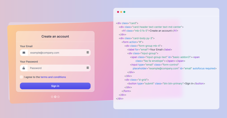
这是一个应用毛玻璃效果的真实示例
你可以在上图中右侧代码后面看到我所说的模糊效果,后方的内容产生了漂亮的变形效果,同时还保持了可读性,赏心悦目。
这就是这篇文章中要构建出的效果。我们将看到如何仅用 HTML 和 CSS 来实现它。
如何制作毛玻璃效果
HTML结构配置
要实现上面的效果,你只需要一个浏览器和一个代码编辑器,因为我们只会用到 HTML 和 CSS。
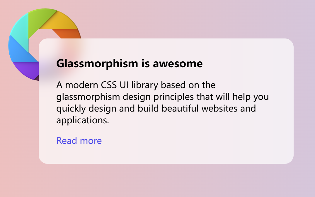
我们将要构建的元素的最终效果如下:
首先,创建一个 HTML 文件,写入如下内容:
1
2
3
4
5
6
7
8
9
10
11
12
<!DOCTYPE html>
<html lang="en">
<head>
  <meta charset="UTF-8">
  <meta http-equiv="X-UA-Compatible" content="IE=edge">
  <meta name="viewport" content="width=device-width, initial-scale=1.0">
  <title>Glassmorphism effect</title>
</head>
<body>
    <!-- 这是填写页面元素代码 -->
</body>
</html>
如果我们想更好看的 Google Fonts 字体,可以在 head 标签中将其引入:
1
2
<link rel="preconnect" href="https://fonts.gstatic.com">
<link href="https://fonts.googleapis.com/css2?family=Inter:wght@300;400;500;600;700&display=swap" rel="stylesheet">
接下来在 body 标签里创建一个卡片元素:
1
2
3
4
5
<div class="card">
    <h3 class="card-title">Glassmorphism is awesome</h3>
    <p>A modern CSS UI library based on the glassmorphism design principles that will help you quickly design and build beautiful websites and applications.</p>
    <a href="https://ui.glass">Read more</a>
</div>
卡片中的内容是什么无关紧要——你可以加入一些按钮、图标或者其他元素。
这时候我们的完整HTML文件应该如下所示
1
2
3
4
5
6
7
8
9
10
11
12
13
14
15
16
17
18
19
20
21
<!DOCTYPE html>
<html lang="en">
<head>
  <meta charset="UTF-8">
  <meta http-equiv="X-UA-Compatible" content="IE=edge">
  <meta name="viewport" content="width=device-width, initial-scale=1.0">
  <title>Glassmorphism effect by ui.glass</title>
  <!-- 可选的字体配置 -->
  <link rel="preconnect" href="https://fonts.gstatic.com">
  <link href="https://fonts.googleapis.com/css2?family=Inter:wght@300;400;500;600;700&display=swap" rel="stylesheet">
</head>
<body>
  <!-- 作为毛玻璃背景的图片 -->
  <img class="shape" src="https://s3.us-east-2.amazonaws.com/ui.glass/shape.svg" alt="">
  <div class="card">
    <h3 class="card-title">Glassmorphism is awesome</h3>
    <p>A modern CSS UI library based on the glassmorphism design principles that will help you quickly design and build beautiful websites and applications.</p>
    <a href="https://ui.glass">Read more</a>
  </div>
</body>
</html>
CSS 样式配置
基础页面布局的CSS配置
很好!现在基本的标签做好了,接下来为HTML中的元素设计基本样式
现在,为 body 标签添加一些样式,并使用鲜艳的颜色和渐变作为背景:
1
2
3
4
5
6
7
body {
  padding: 4.5rem;
  margin: 0;
  background: #edc0bf;
  background: linear-gradient(90deg, #edc0bf 0,#c4caef 58%);
  font-family: 'Inter', sans-serif;
}
在卡片上应用毛玻璃效果之前,先添加一些排版样式,加入以下 CSS 配置:
1
2
3
4
5
6
7
8
9
10
11
12
13
14
15
16
17
18
19
20
21
22
23
/* 设置卡片大小和形状 */
.card {
  width: 400px;
  height: auto;
  padding: 2rem;
  border-radius: 1rem;
}

/* 设置卡片标题字体大小和位置 */
.card-title {
  margin-top: 0;
  margin-bottom: .5rem;
  font-size: 1.2rem;
}

/* 设置a标签的样式 */
p, a {
  font-size: 1rem;
}
a {
  color: #4d4ae8;
  text-decoration: none;
}
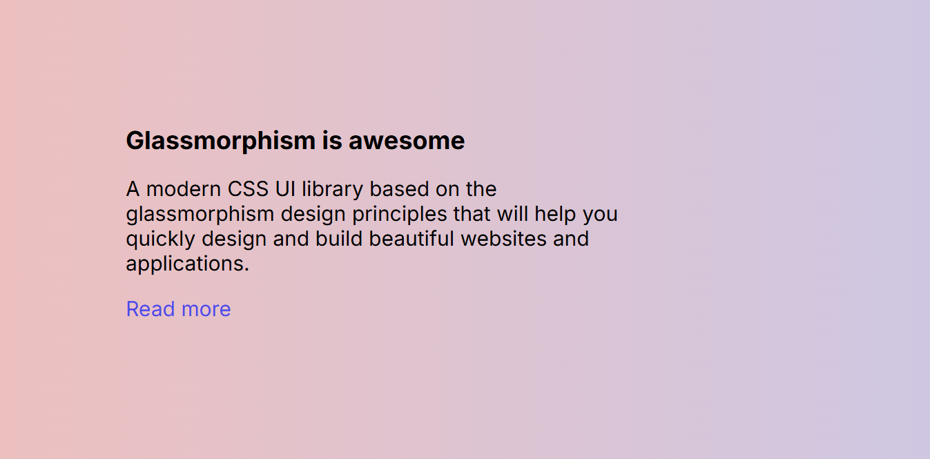
这时候我们已经完成了基础的样式设置, 页面看起来应该像这样
毛玻璃效果的CSS配置
要实现毛玻璃效果,关键在于对元素后方区域应用模糊滤镜,同时元素自身需要具备半透明背景。
要做的只是设置一个半透明背景颜色,并使用 backdrop-filter 属性设置模糊效果。在 .card 元素的样式中加入以下 CSS:
1
2
3
4
5
6
7
8
9
10
11
.card {
  /* 1. 设置半透明背景,让后方的元素可见 */
  background: rgba(255, 255, 255, .7);

  /* 2. 核心:对元素后方的内容应用模糊滤镜 */
  /* WebKit 核心浏览器前缀(兼容 Safari 等) */
  -webkit-backdrop-filter: blur(10px);

  /* 标准模糊属性 */
  backdrop-filter: blur(10px);
}
现在我们已经为卡片加上了毛玻璃效果的样式,可是为什么看起来没效果?
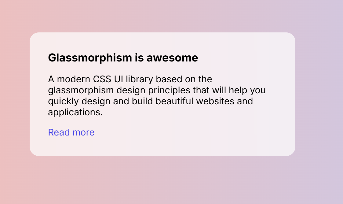
我们还需要在卡片后面加上一些元素,如一些形状或者图片,以便看到它的实际效果。
让我们使用 img 标签在 body 起始标签之后加入一个形状图片:
1
<img class="shape" src="https://s3.us-east-2.amazonaws.com/ui.glass/shape.svg" alt="">
并为 .shape 元素添加以下样式,将其定位在页面的合适位置:
1
2
3
4
5
6
.shape {
  position: absolute;
  width: 150px;
  top: .5rem;
  left: .5rem;
}
现在你应该能看到完整的毛玻璃效果了
backdrop-filter涉及到对背后的区域进行实时渲染计算,因此它是一种性能消耗较大的 CSS 属性。应避免在大量元素或频繁变化的背景上过度使用。- 只有当元素下方有内容时,
backdrop-filter才能看到效果。如果元素是页面的根元素,或者后面没有其他元素,效果将不明显
完整的HTML和CSS文件如下:
1
2
3
4
5
6
7
8
9
10
11
12
13
14
15
16
17
18
19
<!DOCTYPE html>
<html lang="en">
<head>
  <meta charset="UTF-8">
  <meta http-equiv="X-UA-Compatible" content="IE=edge">
  <meta name="viewport" content="width=device-width, initial-scale=1.0">
  <link rel="preconnect" href="https://fonts.gstatic.com">
  <link href="https://fonts.googleapis.com/css2?family=Inter:wght@300;400;500;600;700&display=swap" rel="stylesheet">
  <title>Glassmorphism effect</title>
</head>
<body>
  <img class="shape" src="https://s3.us-east-2.amazonaws.com/ui.glass/shape.svg" alt="">
  <div class="card">
    <h3 class="card-title">Glassmorphism is awesome</h3>
    <p>A modern CSS UI library based on the glassmorphism design principles that will help you quickly design and build beautiful websites and applications.</p>
    <a href="https://ui.glass">Read more</a>
  </div>
</body>
</html>
1
2
3
4
5
6
7
8
9
10
11
12
13
14
15
16
17
18
19
20
21
22
23
24
25
26
27
28
29
30
31
32
33
34
35
36
37
38
39
body {
  padding: 4.5rem;
  margin: 0;
  background: #edc0bf;
  background: linear-gradient(90deg, #edc0bf 0,#c4caef 58%);
  font-family: 'Inter', sans-serif;
}

.card {
  width: 400px;
  height: auto;
  padding: 2rem;
  border-radius: 1rem;
  background: rgba(255, 255, 255, .7);
	-webkit-backdrop-filter: blur(10px);
	backdrop-filter: blur(10px);
}

.card-title {
  margin-top: 0;
  margin-bottom: .5rem;
  font-size: 1.2rem;
}

p, a {
  font-size: 1rem;
}

a {
  color: #4d4ae8;
  text-decoration: none;
}

.shape {
  position: absolute;
  width: 150px;
  top: .5rem;
  left: .5rem;
}
可以在这里查看完整代码
浏览器支持
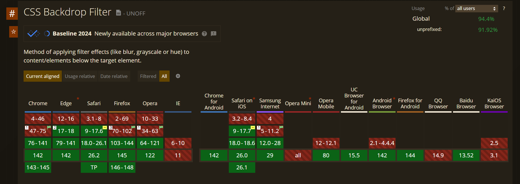
根据 CanIUse.com 网站的数据,全世界超过 94.4% 的浏览器支持这个样式(2025.12数据), 在大多数场景下均可放心使用。